Enlivening old exhibits

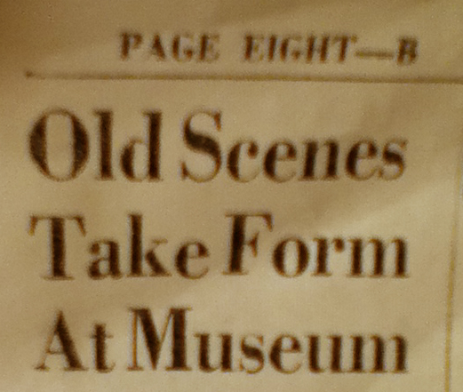
While researching local history, one of my students recently came across an old newspaper article she thought I’d find amusing.  Titled “Old Scenes Take Form At Museum,” it was a piece on a new exhibit opening in the state history museum.

I do indeed find museum history interesting, so I was eager to see how the exhibit was described, what motivated the museum to put it up, and to compare it with the exhibits in the museum today so that I can get a better sense of how the museum’s exhibition philosophies and priorities have shifted.

You can see where this is going, right?

The exhibit featured in the newspaper is still up today, and from the description in the article, it appears it hasn’t changed at all.

The newspaper article was published in the early 1960s.

A cautionary tale

My point in writing this post is not to shame or embarrass the museum in question. (It certainly isn’t alone in having permanent exhibits that are, well, permanent.) As with many state history programs—and, I’m guessing, like many such programs in politically conservative states, where education tends not to be funded as fully as it might be elsewhere—it’s clear even to the casual visitor that the museum doesn’t have the money to mount new exhibits on a regular basis.

Still, it’s important to point out the liabilities of such an approach to exhibitions to underscore the importance of keeping up-to-date with museum theory and practice.

Visitors

First, it’s not good when visitors say about your museum—as did the students, aged 20-50, I took to this museum last month—”It hasn’t changed since I was a kid.”  The number of visitors who appreciate the nostalgia factor is likely to be far smaller than those who would like to see a new exhibit.  Late last year, Reach Advisors delved into their databases to determine what visitors’ attitudes are to changing exhibits—and whether these attitudes differ among museum members, frequent visitors, and occasional visitors.  Among their findings:

  • Museum visitors appreciate changing exhibits.
  • Museum visitors who expect more change in exhibits but don’t see that change happening are less likely to be satisfied with a museum.
  • “Children’s museums, art museums, and more traditional history museums should still take heed of the demand for changing exhibitions.”
  • “Museums of any type that are specifically seeking to attract family audiences should also bear in mind how important change is to parents.”
The Reach Advisors blog continues:

Changing exhibitions does not necessarily mean huge costs, though costs are certainly a factor.  Of the written-in comments we examined asking for more changing exhibitions, none referred to what we call “blockbuster” exhibitions.  Some suggested small changes to liven things up.  Change might be a “science in the news” area, which changes on a weekly basis but would not necessarily meet design standards for a longer-lasting exhibition.  Change can be delving into the permanent collection and highlighting an artist, or a local history topic, and featuring those items through a new lens (a tactic deployed by many museums during these rough economic times).  Change doesn’t mean an expensive line item, and it doesn’t mean changing over the entire museum every six weeks, though it does mean a commitment of some funds and considerable time.

Funding agencies and foundations

One of the most commonly asked questions on humanities and arts grant applications today seems to be some variation of, “What’s innovative about your project?”  A museum might be able to find a grant writer who could answer that question relatively persuasively about a proposed exhibition redevelopment, but if I were on a grant proposal review committee—and I have been—I would be looking for evidence that the museum has dabbled in whatever brand of innovation its staff wishes to implement. In the case of this particular museum, if I saw that most of the exhibits were 30, 40, or 50 years old, I would wonder about the museum’s capacity to implement best practices in museum education and exhibition—simply because I don’t see many signs in the current exhibits that the museum is even interested in experimenting with, say, interactivity or with exhibit panels of fewer than 300 to 500 words.

Let’s say this museum knows it should implement a new degree of interactivity but it hasn’t. Because authentic artifacts are the traditional history museum’s stock-in-trade, incorporating interactivity may at first seem a challenge because visitors can’t touch the artifacts the way they can interact with objects and manipulatives in a science center or children’s museum. Furthermore, if the exhibition development and education staff of a history museum hasn’t been provided quality opportunities for professional development—and I don’t know if that’s the case with this particular museum, but the museum’s exhibits do not reflect the at least last 20 years or so of theory and practice—then they might not be able to think beyond expensive replicas and the sometimes complex  “recipes” for fabrication designed by science centers like the Exploratorium. Once we can force ourselves to think beyond video kiosks, replicas, and dynamic science interactives, we find many possible baby steps toward interactivity or visitor participation.  It’s easy to add a simple paper-and-pen or token-based polling system for visitors, create laminated cards or brochures that offer alternative tours through the museum based on individual visitors’ interests, or affix QR codes to exhibit labels to direct visitors to more in-depth content on the museum’s website or to additional photographs of the object from angles that aren’t visible to the visitor.

Interactivity can be simple and inexpensive to integrate into an exhibit, and much information is available freely online about how to successfully include interactive components in an exhibit. There’s no longer any good reason a museum hasn’t adopted such techniques, and it doesn’t make sense for a museum to ask for funding for a new, innovatively interactive exhibition if it hasn’t shown interest or capacity in more basic interactive techniques.

Donors

Although museum professionals know that in most museums only a small percentage of artifacts ever see the exhibition floor, my sense is that few donors to local history museums understand their treasures likely will remain in storage in perpetuity. Donors who wish to see their gifts on display during their lifetimes may be dissuaded by decades-old exhibits or by temporary exhibits not drawn from the museum’s collection.  In addition, speaking for myself, I’d be unlikely to donate my family’s beloved heirlooms to a museum if the institution lacked the creativity and wherewithal to interpret artifacts in ways that challenge visitors to think critically and creatively.

Solutions

Let’s consider a few ways to update this exhibit relatively inexpensively and thus gain some respect in the eyes of visitors, current and prospective donors, and even funders.

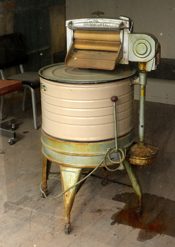
A wringer washer in Wyoming. Image by arbyreed, and used under a Creative Commons license.

First, a description. The “old scenes” mentioned in the newspaper article comprise a kitchen and porch exhibit whose central feature appears to be laundry.  I haven’t paid attention to the exhibit lately, but if memory serves, there is a wringer washer, soap containers, and some other household goods arrayed on a porch.  The article describes it thus: “The porch display. . .will include an old hand-crank clothes washer, ice-box refrigerator, rocking chairs and a stack of wood.”

The exhibit depicts, in other words, a tiny slice of domestic life at the turn of the last century.  My reading of it is as cute and nostalgic in a way that makes me uneasy because the woman who would be using the objects displayed in the kitchen and on the porch is absent; her labor becomes invisible.  So, in this scenario, let’s find a way to make that woman and her labor visible to the visitor.

Assuming visitors can get network reception inside the museum’s building, I recommend adding multimedia content accessible via smartphone, 3G or 4G tablet, or, if the museum is equipped with public wifi, a wireless device like an iPod Touch or wifi iPad.  Having such content available on devices a visitor brings with her, or even on a device that can be checked out from the front desk, means that the museum won’t need to buy, maintain, and update a bulky and expensive audio or video kiosk.  This content might be accessible through a QR code or simply a URL printed at the bottom of the exhibit’s interpretive panel.

Audio content might include the voice of a woman talking about how tired she is after using all these devices or telling a story about how her curious toddler stuck his hand into the wringer when her attention was directed toward another one of her children, and she cranked the handle (audio of child screaming or crying), and the doctor had to be called to examine the child’s hand.  Alternately, the printed URL might take the user to a YouTube video of someone using a hand-cranked washer:

In an underfunded museum such as this one, audio content could be created by interns who undertake research into the use of such machines, then are given free range with Audacity or another free or low-cost audio editing program. Interns also could seek out such video footage of an antique washer, such as I’ve posted above, and embed it onto mobile-friendly pages on the museum’s website. (Of course, best practice for any institution would be to include a link to a transcript of the audio for deaf visitors and a description of the video for blind visitors.)

Or we could tell a different kind of story. This is, after all, a museum with a quarter million objects in its collection, so it has plenty of artifacts it could be exhibiting.  Perhaps we see the open porch at a moment of transition; it’s being enclosed to make a laundry room, and the woman has set her old hand-cranked washer and wringer out in the yard to make way for her new machine, which features an electric agitator. Audio or textual content could describe the woman’s feelings about the new machine at the moment of its arrival, as well as showcase her ambivalence a few months down the road, when she complains about constantly having to repair it, or when she expresses the belief that it’s too rough on her family’s clothes, wearing them out prematurely.

In this scenario, collections and education staff could establish a schedule whereby the laundry machines and interpretive content (text or audio) are updated every few months. Visitors could play a game, made with magnets and laminated photos of old laundry machines, in which they try to place the laundry machines in the correct chronological order.

Or, of course, we could abandon laundry altogether.  It isn’t, after all, the sexiest subject.  Moving away from laundry, however, doesn’t have to mean a complete (and costly) exhibit renovation. The relative openness of the porch exhibit “stage” lends itself to any number of scenes in a way that, say, the built-in cabinets and framed windows of the restored formal dining room in an adjacent exhibit do not. The museum could tell any number of stories about race, class, age, gender, leisure, and labor.

And need I mention that it’s best practice to rotate artifacts?  Changing exhibits allow objects relief from light, vibration, and other damaging phenomena.

Share your thoughts in the comments

I’d love to hear your own stories of

  • permanent exhibits that became a little too permanent, and how the museum resolved the issue;
  • low-cost changing exhibits;
  • inexpensive ways to add or integrate simple multimedia content that enriches an exhibit or shifts its meaning; and
  • old exhibits updated to become more interactive or participatory.

I’m also eager to hear what solutions you’d propose to the particular challenge I’ve shared in this post.  What advice would you give the museum staff?
Are stairway exhibits exclusionary?

I’m finding this project interesting and provocative:

Here is some additional description of the installation from the museum’s YouTube channel:

The Senator John Heinz History Center, “the Smithsonian’s home in Pittsburgh,” and UPMC Health Plan have partnered to encourage museum visitors to climb the stairs and blend health and history with the new SmartSteps exhibition.

Visitors who take the steps to explore the History Center’s six floors of exhibition space will be treated to unique facts about Pittsburgh history and colorful murals with health and wellness tips.

As far as we know, the History Center is the first museum in the nation with an exhibit in its stairwell.

The SmartSteps exhibit is part of the museum’s “Health & Fitness” initiatives, which includes healthier eating options at MixStirs Café, a Health and The Body section inside the Western Pennsylvania Sports Museum, and the nation’s first curator of food and fitness.

Visitors who climb all 123 steps of the SmartSteps exhibit will be rewarded with a complimentary Heinz pickle pin.

I appreciate that the museum is encouraging visitors to think about fitness, and rewarding them for taking some steps (ha!) toward greater physical activity.  That said, I have one big question about the installation:

How does this exhibit even begin to account for visitors with mobility disabilities?

I see that the “passport” stamps visitors can collect are located on the exhibit floor at each level rather than in the staircase, so I suppose if the museum considered collecting all six stamps to be sufficient participation for the reward of a pin, visitors unable to take the stairs could still participate to some extent by taking the elevator and getting off at each floor.  However, the stairway exhibits themselves seem to be off-limits to people who cannot climb or descend stairs, including people who use wheelchairs, scooters, walkers, crutches, and similar devices–not to mention parents with children in strollers.  And isn’t the learning that takes place in the stairway more important than a pickle pin?

In the video, the Smart Steps exhibit is framed as a promotion for physical fitness, with “smart” referencing, I’m assuming, both the exhibit content (learning can take place inside the stairway) and that it’s “smarter,” from a fitness standpoint, to climb the stairs instead of riding the elevator.  If steps are here set up in opposition to elevators, and steps are “smart,” does that make elevators (and by extension, their users) “dumb”? (The museum claims to be trying to “make elevators history,” which of course is also troubling from an accessibility standpoint.)

Near the end of the video, Scott Lammie, a senior vice president with the UPMC Health plan, says, “UPMC Health Plan is just so proud to be a sponsor of the Heinz History Center, and we’re especially delighted to be able to support this Smart Steps exhibit, an exhibit that encourages our visitors to blend health and history.” Might this museum find ways for all its visitors to blend health and history, and not just those who are able to climb stairs?

Perhaps the museum could provide the same content in alternative formats, such as a brochure or website.  However, even if the museum has created such resources–and it’s not apparent to me it has–a brochure or website is not able to provide quite the same experience as the one accessible to the able-bodied.  After all, the video suggests climbing the stairs is a social experience; at 2:27 in the video, generically attractive white people are shown climbing the stairs, chatting and enjoying the experience available to them.

That said, it’s not at all clear to me that a brochure or website showcasing the content would be considered an acceptable alternative under the Americans with Disabilities Act.  At ADA.gov, a page on museum accessibility states that when elevators are broken and exhibition areas thus made inaccessible to visitors with disabilities, “temporary alternate access to exhibitions and programs may be provided using photographic, video, or computer presentations.”  Note the word temporary in that sentence–it suggests such workarounds are insufficient as permanent accommodations.

This all raises, of course, a point that transcends the Heinz Center’s exhibit: Are stairway exhibits forbidden under the ADA? If not, should museums interpret the ADA more broadly, and ensure that at least a portion of every exhibit is accessible to visitors with disabilities?  If so, what constitutes a reasonable portion? For example, in science centers, some interactives might not be 100% accessible to everyone, yet such interactives are at least viewable by sighted people who might not have the strength, flexibility, balance, or dexterity required by some of the stations.  In addition, I have seen art hung above the landing areas in stairways at art museums, but these are isolated pieces and typically do not constitute an exhibition in themselves. The stairway exhibit at the Heinz Center, however, is not viewable by those with mobility issues that keep them from accessing the stairs.

What are your thoughts? Are there ways to make the Heinz Center’s Smart Steps exhibition sufficiently accessible to visitors with disabilities? If not, does that mean museums shouldn’t invest in stairway exhibits?

What’s your museum’s “cello side”?

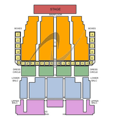
A decade ago, between stints in grad school, I worked in marketing for the Long Beach Symphony Association.  It was an exciting year; the orchestra was seeking a new conductor, and in the organization used the transition as an excuse to revisit its subscription packages.  Previously, the house pricing map looked similar to this one of the Detroit Symphony Orchestra Hall–that is, the price tiers were based on horizontal bands of seats, with less expensive seats at a greater distance from the stage:

DetroitIn consultation with some arts marketing gurus—and I’m afraid the name of the firm is escaping me right now, so please comment if you know the name of the consultants who helped redraw the floor map—the Symphony completely changed its subscription price points.  Some people’s annual subscription prices increased dramatically, while others’ plummeted by hundreds of dollars.  The map looks kind of crazy at first glance:
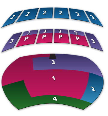
LBclassicsSome of those Level 4 seats are pretty prime.  Imagine being in row 6 or 7, at the inner edge of the green area.  Yet those are the cheapest seats in the house–currently only $79 for a season subscription to six classical music concerts.  (And yeah, you can bet my parents now have a couple of those seats.)
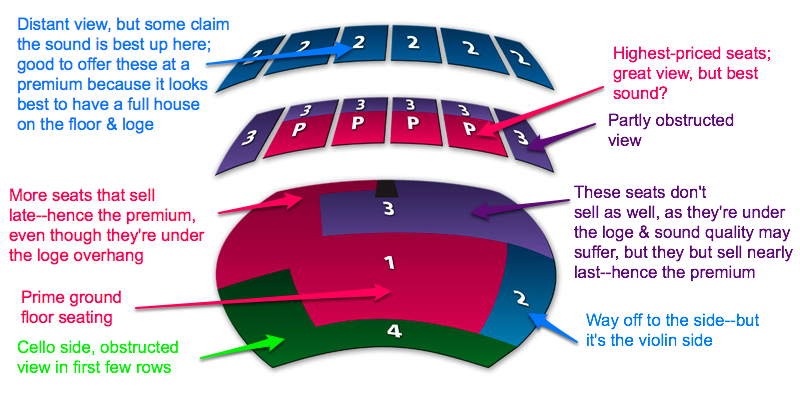
Take a look at the season subscription prices for 2009-2010:

P (center front loge): $344
1 (most of the floor): $339
2 (balcony, and portion of the edge of the floor at stage right): $264
3 (edge and rear of loge, most of rear of floor): $175
4 (first few rows, plus a portion of the edge of the floor at stage left): $79

Let’s reexamine that floor map.  I don’t think I’m about to give away any proprietary secrets here, as this is a published floor map, and anyone who has attended acoustic music performances in a concert hall will know where the preferred seats are, which ones tend to sit empty, and where the priciest seats usually are.  But the map definitely provides some food for thought, and it calls for a close reading.

celloside

Pricing the balcony higher than many seats on the floor and the loge is an interesting strategy from a marketing and public relations perspective.  From this viewpoint, people sitting in the balcony aren’t doing anyone any good.  They’re removed from interaction with the people the box office manager would want them to talk to–those who can talk up the benefits of floor or loge seats.  And they serve no purpose when it comes to concert reviews; you want the front of the house, and if possible the entire floor and front of the loge, packed with people so that the reviewer gets the sense that the Symphony has die-hard fans who won’t miss a single concert.  If you’re reserving a few seats in pricing section 1 for music critics, you want them to see people enjoying the concert–hence the incentive (lower prices) for people to purchase subscriptions in the first couple of rows.

The cello-side and front-row demographic—the level 4 subscribers—is a potentially interesting one.  I don’t have access to the latest demographics from the Symphony, but you can imagine who might be clamoring for those seats: retirees with a limited income, students, frugal types, former or amateur cellists, and newcomers to the symphony experience who might not understand that the cello side is considered, well, more uncouth and less desirable than violin-side seats.*  They’re not the symphony’s core demographic–those folks buy seats in areas 1 and P–but they have the potential, particularly if they’re young, to rejuvenate a symphony audience whose average age is increasing.

I can definitely imagine a scenario where those who sat in the front couple of rows for a season or two decided to upgrade so that they could have a less obstructed view.  Or cello-side folks who want to move to the violin side or the center floor.

How does this apply to museums?  Think about the things for which you charge:

  • General admission
  • Admission to special exhibits
  • Individual or family membership
  • Enrichment activities for children or families
  • Behind-the-scenes tours
  • Lectures
  • Museum-sponsored field trips
  • Other special events
  • mp3 player rentals for audio tours
  • Food in the café
  • Items in the museum store

Which of these things are most likely to bring in the door people in the demographics that you’d like to turn into regular visitors and lifelong fans?  Which of these products and services–alone or in bundles–might you offer to a limited number of patrons who are particularly attractive to your marketing department?  What, in short, is your cello-side offering?  What might you offer, and at how low a price point, to bring in those who wouldn’t otherwise participate in your events?  I’m not talking about student discounts to bring in young people.  I’m talking about some kind of crazy, coveted, and perhaps quasi-secret discount (secret because it’s marketed only to select segments).

Is your art museum near a large research university, but you’re finding that scientists aren’t coming to the museum in the same numbers as the humanists?  Put together an special evening tour with a wine and hors d’oeuvres reception plus membership package for members of the local university’s Association for Women in Science.  Offer childcare at the event so harried scientist-mothers will find it even more appealing.

Want more middle-class African American families to visit regularly on weekends?  Offer a special event package and family membership to members of an AME church.  Do your research and target this specific church’s interests.  For example, are the parishioners interested in hands-on exhibits about health for their kids? Art installations about green living, with DIY gardening tips? Dialogues about increasing the number of grocery stores in neighboring communities?

Want to attract young, highly educated professionals with the potential of large future income (and donations and board of trustees service)?  Offer a special “thank you for serving our community” offer or event to medical students and young doctors doing their residencies in local hospitals.  Once you have them in the door, if you’re a science museum, you can try to recruit a few of them to participate in a Café Scientifique on health issues of interest to your community or ask for their help in writing questions for, or being auctioned off as a “lifeline” during a pub-quiz-style fundraiser.

Your cello-side people, in short, are those who might not normally make a habit of coming to your museum, but who are curious and need a little nudge in the form of an interesting offer that represents a significant discount over the price paid by your actual core demographic.  Bring these folks in the door with an interesting–and exclusive–experience, and then lead them to higher levels of involvement, participation, and donation.

*No offense to cellists.  Personally, I prefer cello side! :)

What will the museum of the future look like?

I wrote this post for a more general audience at BlogHer, but the post ended up including a nice round-up of links, so I’m sharing it here as well, along with a couple of provocative questions near the end of the post.

Late last year, the American Association of Museums released a discussion paper titled Museums & Society 2034: Trends and Potential Futures. The report looked back 25 years to 1984 as it predicted what museums will look like 25 years from now. Specifically, the 20-page report examined “demographic trends, changes in the geopolitical and economic landscape, shifts in technology and communications, and the rise of new cultural expectations.”

For example, after pointing out that a larger percentage of the U.S. population will be senior citizen in 2034 than are seniors now, the report suggests museums will not only be accessible to people using walkers or wheelchairs, but will sport larger exhibit labels and will incorporate aspects of universal design as a matter of course. In another example, volatile energy prices will lead museums to

educate the public on how past societies coped and adapted to tectonic shifts in their resources. They will help society learn from history as we cope with a new era of more expensive energy, lower consumption, carbon constraint and climate change. Museums have uniformly adopted green design as a mark of excellence, leading by example and integrating green practices into operations. Some museums operate joint storage facilities designed to minimize energy costs while providing appropriate climate control. More museums establish satellite locations to serve outlying communities, reducing their audiences’ need to travel.

Some of the report’s predictions will come to pass much earlier, I hope. The eco-trends are notable, but even more relevant at this moment, I think–as I contemplate the possibility of my own job falling before the scythe of university budget cuts–is the suggestion that museums become resources for “communities with job losses reinvent themselves in the new knowledge-based economy.” Yes, please–sign me (and the rest of the giant University of California community) up! Indeed, Elaine Heumann Gurian has suggested that museums might serve some of the same functions as soup kitchens in the current downturn. (Be sure to read Marjorie Schwarzer’s reply to Gurian for some very interesting historical context.)

But in order to understand the future of museums, we first must look at their present. And it ends up that even museums aren’t at all in agreement over what constitutes a museum. As Elizabeth Merritt, director of the Center for the Future of Museums wrote today,

What is a museum? As a group, do we really have one unique element or set of characteristics that unite us as a field, while distinguishing us from other types of organizations? Are children’s museums (three quarters of which do not own or use collections) really in the same business as art museums? What about science centers? How much do museums that primarily exist to serve the general public have in common with museums like the Peabody [Museum of Natural History], where the majority of the collections serve a specialized community of researchers?

And collections are just one parameter—there are many others, some very complex and hard to characterize. For-profit museums like the International Spy Museum or the Museum of Sex look just like any other museum to their visitors, but their governance, accountability, and regulatory environment are so different that the National Standards and Best Practices for U.S. Museums don’t cover them.

No discussion of the present and future of museums would be complete without a mention of the following issues:

I think it’s awesome that women are doing so much of the thinking about and planning for the museum of the future and the future of museums. Do you think women think and talk about museums differently than do men because we experience the world in different kinds of bodies?

How do you envision the museum of the future? What do you want your experience to be in and with museums? And how–if at all–would you like to see museums involved in your community?

What can museums learn from the decline of American newspapers?

(Cross-posted at BlogHer)

Those of you who know me well know that my husband is an all-around, old-time, self-described “newspaperman.”  He’s done writing, editing, photography, graphic design, web design, telepimping (coordinating a newspaper’s classified-ad and voicemail-based dating service), and anything having to do with “putting the paper to bed”—that is, getting it to the printer.  And in fact, we met ten years ago when I was (briefly) a reporter and he was production manager of a thriving community newspaper.  So there’s a special place in my heart for the American newspaper, and especially the small, independent, scrappy community newspaper.

But there’s also a place in my heart for—and a good deal of my brain dedicated to—museums of all stripes.  And since both museums and newspapers are community institutions that aim to inform, advise, and entertain, there are some lessons—cautionary tales, really—museums can learn from the death spiral of newspapers.  Much of what I say here is basic business common sense, but the decline of the newspaper industry gives us an opportunity to check in with our institutions and brainstorm new opportunities.  Here, then, is my advice:

1. Even in a new media age, don’t water down your original product. For newspapers, the crumbling of their product began several years ago with newspapers trimming the width of their pages, and then the decline snowballed with fewer comic strips and stock listings, consolidation of sections (e.g. business with regional or metropolitan sections), then the removal of certain sections on some days of the week (e.g. no more features sections—bye-bye, Home & Garden—on Tuesdays).  It’s been a death spiral: advertising declined; printing and paper costs rose; newspapers decreased in breadth and depth (literally and metaphorically); people unsubscribed; advertisers saw smaller circulation numbers and pulled their ads; repeat cycle.  Now, whether this product needs to be delivered on paper is debatable, but newspapers needed to find a way to get their content—in whatever form—in front of people without decreasing its quantity or quality.  Don’t let the apparent value of your product decline, even if that product morphs into a new medium.  Remember, “rich media” doesn’t guarantee an enriching experience.

For museums, this means thinking not just about mission, but about what products exactly your primary audience enjoys.  Hands-on exhibits?  Outreach programs?  Tours of a garden or arboretum?  Classes?  Historical reenactment?  In an economic downturn, museum visitorship frequently increases.  Which of these programs will you expand, and how will you know which to increase?  What opportunities will people have to continue their experience and learning after their visit?  As you ask yourself what to build upon, consider this reflection on newspapers from the American Journalism Review:

One of the rules of thumb for coping with substitute technology is to narrow your focus to the area that is the least vulnerable to substitution. Michael Porter included it in his list of six strategies in his book “Competitive Advantage: Creating and Sustaining Superior Performance.” The railroads survived the threat from trucks on Interstate highways and airlines by focusing on the one thing they could still do better: moving bulk cargo across long distances.

What service supplied by newspapers is the least vulnerable?

I still believe that a newspaper’s most important product, the product least vulnerable to substitution, is community influence. It gains this influence by being the trusted source for locally produced news, analysis and investigative reporting about public affairs. This influence makes it more attractive to advertisers.

By news, I don’t mean stenographic coverage of public meetings, channeling press releases or listing unanalyzed collections of facts. The old hunter-gatherer model of journalism is no longer sufficient. Now that information is so plentiful, we don’t need new information so much as help in processing what’s already available. Just as the development of modern agriculture led to a demand for varieties of processed food, the information age has created a demand for processed information. We need someone to put it into context, give it theoretical framing and suggest ways to act on it.

Replace “newspapers” and “journalism” with “museums” and “exhibition development,” and you have some new food for thought.

2. Keep your product in front of your customers. Make “getting together” with your customers at regular intervals a habit. (For newspapers, this meant daily subscribers and the occasional Sunday-only subscribers.)  Make your product or service a sensory experience, and join it with others.  Newspaper readers heard the shifting of pages, felt the flutter of air on their faces as they flung a section open at arm’s length, felt ink dry out the skin on their fingertips, smelled that distinctive “newsprint” scent.  Many people associated newspapers with the taste of coffee or orange juice, the comfort of toast, the rocking of the train or subway, the feel of cold bare feet on the driveway.

How is your museum providing a sensory experience?  How are you going beyond vision and hearing as sources of input?  And with what do your visitors associate your museum—by which I mean things they can’t get from your website?  Think about the smell of redwood trees at the trailhead near your museum, the rush of adrenaline at the moment they first step from the Metro escalator onto the Washington, D.C. Mall to find themselves surrounded by Smithsonian museums, the surprisingly pleasing smell of tar once it’s recontextualized via the La Brea Tar Pits, the occasional gross-out factor of scientists dissecting or prepping oozing specimens in a lab within view of the exhibit floor.

If you do want more visitors to your web site, don’t just tell them what goes on at the museum by offering a calendar of events or a summary of exhibits and experiences.  Instead, share your collections.  Give visitors a taste and encourage them to come see the real thing.

3. If you’re a small museum, don’t aim to be too big.  Instead, embrace the local and hyperlocal. The smaller a geographic area your museum serves, the broader the swath of the population it can serve.  Children’s museums and science centers may need to serve several cities, and their clientele usually age out of their offerings.  Remember: your niche need not be demographic; it can be geographic.  A much smaller museum can focus on one city and surrounding towns, yet provide experiences for a more diverse demographic, including, for example, seniors and new moms whose kids aren’t yet old enough to enjoy the museum. Newspapers that have remained competitive serve all readers.  They haven’t just chased the young in hopes of cultivating a new generation of subscribers to the print edition.  In addition, the most successful newspapers had more female readers than male, even though they didn’t see themselves as targeting women consumers.

Is what’s on your exhibition floor of interest to your visitors because it’s generally interesting, or because it’s locally interesting?  Consider opportunities for furthering civic discourse.  If your town has for years been up in arms over what to do with traffic on one of its main thoroughfares, then your institution should be, depending on its type of museum:

  • creating exhibitions with information about traffic engineering and giving visitors opportunities to practice individual and collaborative decision-making.
  • telling the history of the street and how the surrounding neighborhoods have evolved, including collecting stories from current and former residents.
  • hosting public forums or town hall meetings about the street in question.
  • having an arts competition (with (donated) prize breakdowns by age bracket and a special section for professional planners and landscape architects) to craft a new vision of the street in whatever media makes sense (paint, pencil, model, multimedia).

4a. Consider equity of pay and opportunity. At the big newspapers, the investigative reporters and top columnists make a good salary.  Not so much at the smaller papers.  At the (very profitable) community newspaper where I worked in 1999, my starting salary as a journalist was $22,000—and I had an M.A. in English/writing and plenty of clips already to my name—and I didn’t get a day of vacation until I had worked there for a year, and then I only received 5 days each year.  We worked holidays and didn’t have a sick day policy—basically, you went home if you were throwing up in the storage area, er, newsroom.  Our contracts (illegally, I suppose) forbade us from discussing salaries, but I suspect the features editor, who had been there many years, didn’t quite make $40,000.  Mr. MB, who had years of experience but only a high-school education, made upwards of $50,000, and as production manager he received a bonus every time the paper went over a set number of pages because it meant he had to do extra work.  The reporters, who had to write stories to fill the space around the extra ads sold that week, didn’t get any additional pay on the many weeks the newspaper grew.  But you know who was really making buck?  The salespeople.  Some of the display ad folks and at least one of the classified people were rumored to be making six figures.  These folks were investing in additional real estate in Southern California.  Me, I was living with my parents.

Yes, I was the new kid on the block, but I’ve seen this inequity in the ratio of labor to pay in many newspapers.  It’s why young people don’t stick with reporting for community newspapers; they can’t afford it.  Why write articles about parking enforcement for the local paper when I can get another 8-5 job that pays far better, and then blog in the evenings and weekends about stuff I really care about?  No, I’m not writing hard-hitting investigative pieces, but nor was I doing so for my community paper.  So:

4b. If your museum has a lot of turnover in educators and other front-line personnel, ask why. Those kinds of jobs (I’ve had ’em) are repetitive and tend not to pay very well, so there’s a high rate of burnout.  If you can’t afford to pay your educators and other customer-service employees more, find other perks to give them, such as more flexible schedules, a wider choice of health insurance plans, or the opportunity to work on projects that stretch their knowledge and challenge them, such as writing exhibition labels, brainstorming possibilities for grants, and developing new programs.  Even though I didn’t get much of a bump in pay or resources when I moved from education to exhibit development, the new challenges (e.g. producing a hands-on, inquiry-based, 1,200 square-foot exhibit with a materials budget of $100) and opportunities (getting to work with new tools and think in different ways about audiences) meant I was happy to stay on staff.

Today I work with graduate students who have committed themselves to museum careers.  They’re required to work in museums prior to being accepted to the program, they work for museums while they’re in the program, and they get pretty good placements when they graduate.  But they’re entry- to mid-level museum staff in their 20s and 30s (and, less frequently, 40s and 50s and 60s), and they’re tired all. the. time.  They love the missions of their institutions, but they crave challenges beyond their day-to-day duties.  Give them a chance to impress you by dropping an unexpected, interesting challenge in their laps.  You may be repaid handsomely.  One of my students recently wrote to me asking how much credit she should ask for—and how she should ask for it—as the very large museum for which she works plagiarizes from her thesis in the process of revising its business model.  These young folks (by which I mean people my age! 😉 have HUGE ideas to contribute.  I remember being among young museum staffers tossing out really great ideas (IMHO) at staff meetings, only to see the institution take an opposite tack and fail in some significant, programmatic way.  This was particularly true when development people pulled together grant and foundation proposals without consulting front-line educators or program evaluators.

5a. Have multiple revenue streams. Craiglist and Monster.com decimated classified advertising in most categories that had previously been published in newspapers: items for sale, job postings, people-seeking-people ads, etc.  Although admissions may rise slightly during a recession, economic depressions do make museums think hard about revenue beyond the gala fundraiser, the grant, and children’s birthday parties.  Look at your mission and see what products and services you can provide to your community—and beyond—that meet an unfulfilled need.

Find new streams of revenue instead.  I’ll elaborate on some of these in the next section.

5b. Beg, borrow, and steal alternative business models. Changing your business model doesn’t have to mean compromising your mission; it does mean being more flexible and creative in the ways you finance it.  And it doesn’t mean doing the obvious thing.  For example, many paid-subscription papers are considering moving to an online-only subscription- or advertising-based model, or to online articles supported by micropayments. Yet many of the newspapers that are best weathering the economic storm are actually free weekly, hyperlocal papers.  For example, the newspaper company where my husband and I met had two papers: one was delivered to doorsteps in a high-income zip code within a large city, and the other, offered on newsstands, provided news of interest to downtown politicos and businesspeople.  Advertisers in these publications have a very good idea of who’s reading these papers.

Building on these ideas of niche audiences:

  • Offer free admission to specific target audiences, sponsored (via ads in e-mails, flyers, and on site) by advertisers relevant to the specific audience. (Caution: I’ve seen display ads in senior newspapers.  They can be very depressing and prone to stereotyping.  Select your advertising partners carefully.)
  • If some of your staff have expertise they might offer others in your community, rent them out for a few hours at a time or by the small project at a higher-than-their-usual rate  to businesses, universities, and other nonprofits.  Chances are there’s someone on your staff who knows quite a bit about database management, grant writing, cultivating the lucrative family market, new media, or partnering with other organizations to increase revenue—all high-value skills that are in demand.
  • Organize niche conferences in a field related to your museum’s content or location. Bring in sponsors and charge admission. A hands-on children’s museum might host a conference—complete with keynote speakers and submitted panels—on any number of topics, including engaging gifted children in an era of high-stakes testing and No Child Left Behind or making learning accessible, inside the museum and out, to children (or anyone else) with disabilities.  A community-facing art museum might put together a conference on art therapy, and a history museum with a newly discovered artifact related to Abraham Lincoln might host a symposium on Lincoln combined with a conference for Lincoln enthusiasts.  Thanks in part to web platforms that handle registration and billing, conferences don’t have to be a nightmare to organize, especially if everyone in your organization pitches in.  (Check out this testimonial about conferences from NewWest:  “Everything on the Website is free, but we have about 1,000 people who pay $150 or $300 or $500 a year for their NewWest experience. This experience comes through conferences and events, which have been a major revenue source and an excellent promotional vehicle for our site. The conferences are content-driven – programming a conference is in many ways very similar to editing a magazine – and thus we see it as part-and-parcel of the journalistic mission, not a distracting commercial add-on. If anything, people like conferences even more when they spend so much time interacting via a computer screen. Conference attendees are our loyal subscribers, and they pay a lot for our content.”)
  • Create children’s workbooks to accompany your exhibition, but make sure they’re stand-alone, too.  Offer them as paid downloads or in print versions in your museum store.  Many museums already create pre- and post-visit activities for teachers, so why not expand on these and offer them to visitors (and non-visitors!) instead?
  • Make your content available at services like CafePress and Zazzle.  I’ve seen a lot of cool material culture and ephemera I’d love to have printed onto a poster on high-quality paper like the premium posters created with UV-resistant archival inks printed on heavy paper.  Offer links directly from key artifacts to these services, and set up a storefront at each of these services as well.

6. Don’t ignore or dismiss the blogosphere. Nina Simon’s Museum 2.0 is packed with fabulous ideas that I’m confident will drive museums over the next decade. Museum Audience Insight offers just what it promises–thoughtful insights on museum visitors. The informatics folks blogging at conference.archimuse.com also point to new developments that can serve as inspiration or case studies for your own museum’s evolution.  PreservationNation keeps museum folks up to date with the latest developments in historic preservation. Signtific is another new source of inspiration on engagement and participation.

What are your thoughts?  What else can museums learn from the decline (or relative success) of newspapers?

Millennials in the museum: an educational dilemma

Although I teach in a museum studies graduate program (and wish I could do it full-time), my primary job is to help faculty become more thoughtful about teaching undergraduates at the University of California, Davis. Since I began working in the university’s Teaching Resources Center, faculty have come to me for assistance with myriad issues, but there are three that arise more frequently than others:

  • They are teaching very large (200-900 student) classes.
  • They feel compelled to cover large amounts of material.
  • Their students can’t think analytically–or write.

The first and third of these quandaries are generational ones in that in the U.S. we are educating students in an era of reduced resources, higher enrollments, and high-stakes testing in K-12. The second quandary relates intimately to the first and third.

The problem of coverage, what I have heard termed “the tyranny of content,” has of course long plagued curators and exhibition developers as well as professors. In museums it takes many forms: a desire to exhibit all the varieties of one object (e.g. butter churns, to borrow an example from Dan Spock) or to cover an immense amount of material and history in too small a hall (e.g. the Smithsonian National Museum of Natural History’s African Voices exhibition), for example.

Museums have also long had to deal with large numbers–sometimes crushing numbers–of visitors to new, blockbuster, or otherwise favored exhibitions. How to serve so many people while still giving each visitor a sense that she has had a personalized interaction with the museum content is one of the great quandaries of museum education, and we’re barely scratching the surface of this problem with some tentative experimentation with digital and/or mobile devices.

The new generation of young adults, however, presents a particular challenge to museum educators, exhibition developers, and docents. If they attended a public university in the U.S., and especially in California, these “Gen Y” “Millennials” are likely to have been a victim of what I call the factory farming of students: large lecture halls crammed with students, multiple-choice tests, and a long series of general education courses that represent to them not opportunities to explore new disciplines, but rather a series of boxes to be checked off: the writing requirement, the diversity requirement, the quantitative thinking requirement, etc. In addition, these college students and graduates came of age under No Child Left Behind, a regime of high-stakes testing that led school districts to “teach to the test” rather than engage in the student-centered learning that imbues young people with curiosity, gives them the intellectual tools and cultural literacy they need for interpreting and analyzing the world, and ensures a desire for lifelong learning. Many of these young people are thus victims of large-scale, depersonalized educational systems. Trained to memorize and regurgitate instead of interpret and create, they are not equipped to engage with museum content–and worse, they may not even be aware of their predicament.

Clearly, this generation provides an opportunity for–or, rather, is in desperate need of–visitor studies that examine how trends in our K-12 and university systems affect museumgoers’ understanding of material culture, art, hands-on science exhibits, and natural history objects. What new kinds of interpretation will we need to develop? How can we teach interpretive skills to those in galleries as well as convey content?

Based on my own experiences in the Gen Y classroom, my observation of others’ classes, and my consultations with faculty, I offer here some tentative suggestions for meeting the needs of Gen Y learners in the museum.

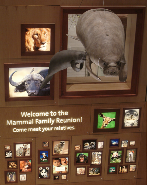
Provide strong orientation. By this I mean museums need to strike a balance between free-choice learning and making learning objectives painfully explicit. How this might look will vary by institution, but one place to start is with a strong framing device.  One exhibition that accomplishes this well is the new mammal hall at the Smithsonian’s National Museum of Natural History.  There is no clear pathway through the exhibit hall, and it’s easy for the dramatically lit trophy-quality mounts and evocative soundtrack to overwhelm the visitor with their pure spectacle.  However, the museum has framed the exhibition in an orientation gallery, using this conceit:

photo courtesy of the Smithsonian Institution

Visitors are welcomed to the Mammal Family Reunion and learn that mammals can be identified because they all share three basic traits: they have hair or fur, they possess specialized middle ear bones, and they produce milk for their young.  Elsewhere in the exhibition, visitors learn more about mammals’ diverse environmental niches and adaptations, but the framing device is that all of these animals, despite their tremendous diversity, are from the same “family” (more precisely, the same class within the phylum chordata).  Certainly there are some of you saying, “Really?  That’s all people are going to take away from this exhibit?  That mammals are hairy, produce milk, and have something in their ears?”  To which I say:

  • Millennials have learned to memorize and retain, at least temporarily, facts about a subject. Learning (or, in the case of college-educated millennials, re-learning) three things about mammals is an excellent starting point for them.
  • Millennials’ science education has suffered in K-12 as a result of NCLB’s emphasis on math and reading comprehension.  Drop them in a place as large as the NMNH and they’re going to feel overwhelmed.  Give them a flash card’s worth of information to begin with, and they’ll feel comfortable.
  • This is only orientation information, a short list of objectives they can carry with them as they wander around the exhibition and apply these facts or principles to what they’re seeing.

Ideally, as the visitor walks through the mammal hall, she would be learning concepts that build upon these basics.  For example, mammals all have fur or hair, but they have differing amounts of it.  A jackrabbit and a sea otter have dramatically different densities of fur because they have adapted to living in very different environments.  Although they descend from a common ancestor, these animals evolved in ways that allowed them to occupy, and even thrive in, a niche.

Help visitors develop analytical frameworks and interpretive skills. We see a bit of this in the example above.  Visitors learn three basic facts, and then begin to make observations on their own about each fact–e.g. that mammals’ fur density differs by species.  Next the visitor should be prompted to puzzle through why the fur differs.  And then comes the big lesson: What are humans doing to change the environments in which these animals live?  What happens when an animal evolves over tens or hundreds of thousands of years to occupy a niche that is decimated by humans in a matter of years?  What are humans’ responsibilities to endangered mammals?  Why might humans be more amenable to protecting mammals (AKA “charismatic megafauna”) than they are other species, and what are the advantages and liabilities of this approach to conservation?  Labels, podcasts, hands-on activities, docents/explainers, and visual organizers all can contribute to this learning.

Customize streams of content. Provide interpretive tours organized around visitor interests instead of gallery space. Offer audio tours created by a variety of experts or amateur enthusiasts, including “guerrilla” audio tours.  Examples from our mammal hall might be an evolution-focused podcast, a conservation-focused activity book or handout for children, or ways for visitors to send themselves the URLs of content related to the exhibition areas in which they’re most interested–e.g. polar mammals or desert creatures.

Provide content in multiple formats. The streams of content you provide must be accessible in several formats.  This might mean visitors can generate e-mail messages to themselves–perhaps a series of autoresponders–to learn more post-visit, send to their mobile phone or PDA the snippets of code they need to embed customized media in their blogs or Facebook news streams, or pick up topic-specific paper handouts upon exiting the exhibition.

Offer opportunities for collaboration. Hands-on exhibitions sometimes call for cooperation among visitors, but opportunities for collaboration are rare–and it is a skill that Millennials may not have had the occasion to practice in high school or college.  They do, however, excel at text-messaging and similar brief format activities.  How might you use cell phones’ texting capacities, for example, in your exhibition space?  Once you have Millennials contributing as individuals, you can adapt your content to move them up Nina Simon’s hierarchy of social participation.

UPDATE: Since I wrote this post, NPR has posted another segment in their Museums in the 21st Century series–and this one addresses how the culture of testing has impacted field trips for school kids.